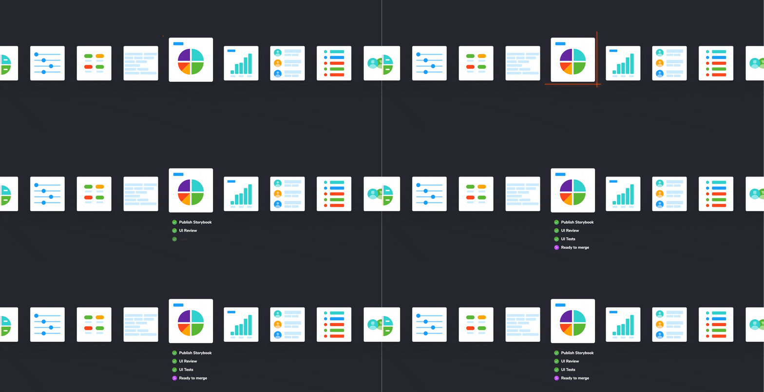
Chromatic 2.0 — Code review, but for UI
We’re launching Chromatic 2.0, a free cloud service for Storybook that helps teams review user interfaces together.
Summary: We’re launching Chromatic 2.0, a free service for Storybook hosting that helps teams review user interfaces together. Along with visual testing, we automate the implementation review process so you can ship faster.
Nothing is perfect the first time, especially user interfaces. UIs require refinement to become production-ready.
Here’s the typical iteration process for developers. You request team feedback. Screenshots bounce back and forth. Change requests pile up. Then you race to push updates.
It’s a mess.
I’m thrilled to announce Chromatic 2.0, a free service for Storybook that automates the UI review process. It helps you gather feedback, improve implementation, and get final sign off.
Why review UI?
Let’s get a question out of the way. You already have code review, deploy previews, task managers, and chat. Why do you need another tool?
Modern UIs contain hundreds of components resulting in thousands of possible states.
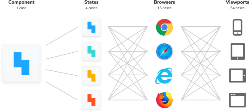
The easiest way to confirm that UI updates “feel right” is by hand. But it’s awkward to visualize every possible UI state. You resort to taking screenshots, recording videos, or pasting a list of URLs in a comment.
What’s more, UIs have countless stakeholders that use different tools. It’s easy to end up with a mountain of feedback to sort through.
Setting up a first-class, cross-discipline contributor experience used to take my teams months. Today, I can build it myself in a few clicks thanks to Chromatic!
— Kaelig Deloumeau-Prigent, Shopify
Code review, but for UI
Developers already capture important UI states as stories. What if you could use those stories to also gather feedback for stakeholder sign off?
Check out this workflow:
- Build components and stories as usual
- Publish Storybook to shared workspace
- Gather feedback on stories
- Iterate UI alongside your team
- Pass PR checks when stakeholders sign off
This workflow helps you gather precise feedback down to the story. You don’t have to babysit PRs or nag teammates to look at your work. Everyone goes to a common workspace that contains the latest requests, comments, and components.

You build UI and Chromatic automates the rest
We interviewed teams at Shopify, Algolia, O’Reilly Media and the Storybook community. It was clear that developers loved building UI components, but were slowed down by the subsequent review process.
UI review shouldn’t be complicated. Chromatic 2.0 makes it natural by syncing with Storybook and your version control system.
UI review with your team
Chromatic publishes your Storybook to a secure CDN when you push code. This gives your team a workspace where folks can comment on UI work.

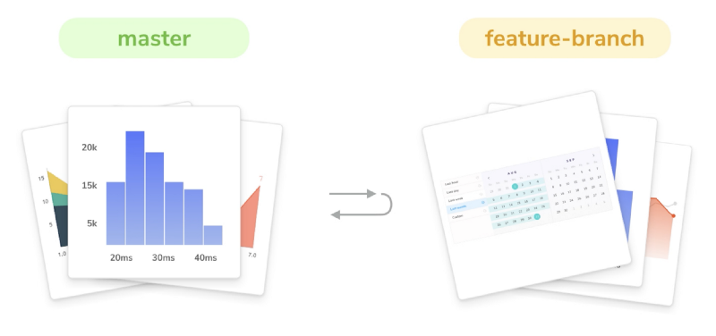
Every time you create a pull request, Chromatic scans for new or updated stories. It compares stories between your PR’s feature and target branch to visualize incoming UI updates.
Stakeholders navigate to Chromatic.com to see a curated list of updated stories. Each story is interactive, just like in Storybook.
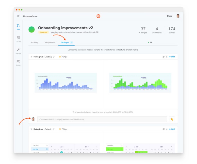
Request feedback by assigning stakeholders. When everyone signs off, the PR check for “UI Review” passes and you’re ready to merge.
Catch UI bugs instantly
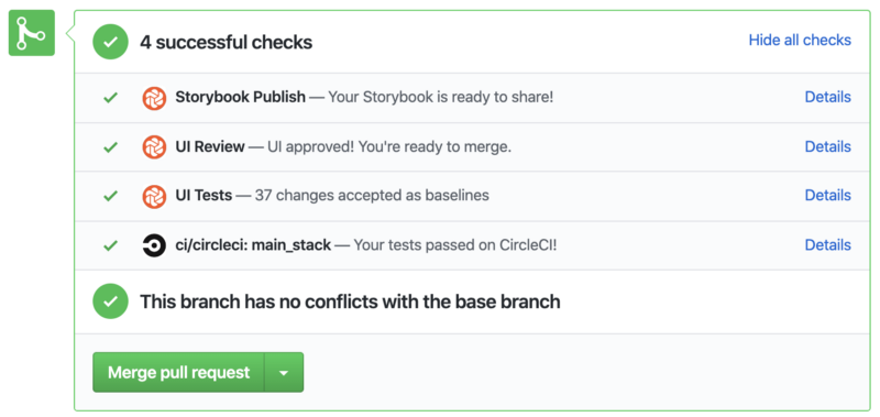
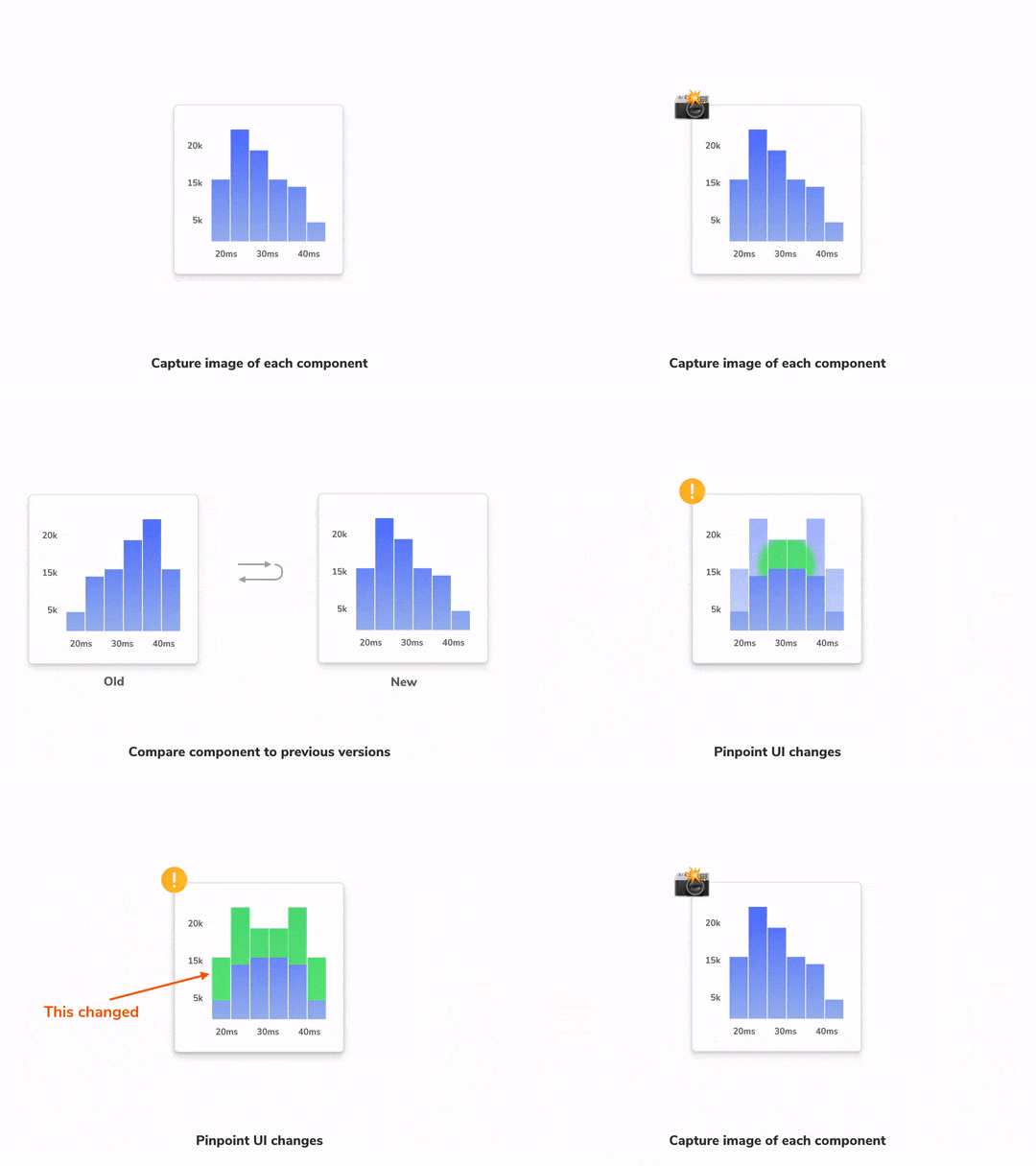
UI review works best when the implementation doesn’t have obvious problems. Chromatic automatically detects UI bugs before you share your work with others.
Chromatic turns your stories into visual test baselines. Each story is rendered in Chrome, Firefox, and Internet Explorer 11 simultaneously then compared to a screenshot of the “last known good state”. Whenever there are UI differences you get notified.
Use visual baselines to catch errors during development. Once you’ve fixed any UI bugs, submit your pull request for UI review to get feedback from your team.
Keep a history of UI changes
Dramatic UI changes often require extra information to verify. Folks ask “what did this used to look like?” or “how did it work before?”
Chromatic indexes component stories so that you can reference past implementation. Every story is documented, versioned, and searchable in one place.
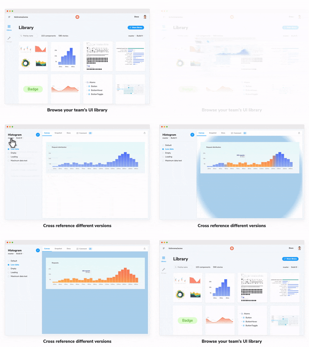
Chromatic is fully compatible with Storybook Docs.
Powered by continuous integration
Leading teams automate build tasks with continuous integration. Add Chromatic to your CI pipeline to unlock new PR checks. This makes it easy to sequence UI operations and gauge implementation progress.
UI review for Storybook, for free
UI developers deserve purpose-built tools. That’s why our team maintains Storybook in the first place. Chromatic 2.0 gives Storybook superpowers.
Starting today, you can use Chromatic for free — the new Essentials plan contains everything outlined in this post.
- ✅ Publish unlimited Storybooks
- ✅ Review with unlimited collaborators
- ✅ Visual test with 5,000 free snapshots/month.
- ✅ Index component history across branches and commits.

Frequently asked questions
How does Chromatic make money?
We sell premium plans to professional teams. This sponsors our open source work and the free plan.
What tools or integrations does Chromatic 2.0 replace?
Chromatic is designed for UI development. It’s one integration that replaces the ad hoc toolchain most teams use.
- UI collaboration: Slack, email, screenshots, gifs
- UI change requests: Jira, GitHub issues, Asana, Trello
- Storybook deployment: S3, Heroku, Netlify, Now, Surge
- Visual testing: Backstop, Puppeteer, Applitools, Browserstack
That said, we still use some of these tools, but for other cases!