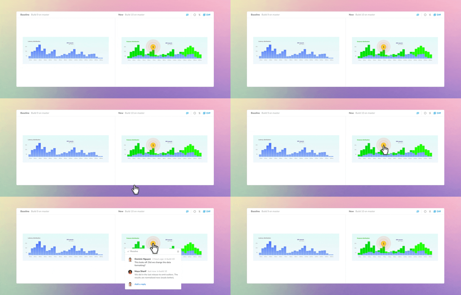
Comment on UI changes
Pin comments, inspect changes, and rewind through baseline history
Debugging UIs is an art. The trickiest bugs are often buried in the nuances of font styles, color shades, and layout position.
Chromatic automatically detects subtle UI changes, but you still have to figure out if they’re intentional updates or bugs. The simplest way is to ask teammates for a second opinion.
I’m excited to share new workflows for collaboration and discussion on UI tests. Our goal is to create a shared workspace where UI teams can help each other fix bugs.
- 📍 Pin comments
- 🔦 Inspect snapshots
- 🧵 Baseline history
Note: Pinned comments aren't available in UI Review yet.
How to fix UI bugs together
UI testing requires coordination across disciplines. You might ask your designer for styling clarification or your product manager to confirm behavior.
In Chromatic, that’s straightforward because you can link teammates to a specific test or build. Your teammates will get a suite of tools for giving feedback, rewinding through changes, and reviewing UI.
Comment on the details
Start a discussion to point out a bug or ask questions. Discussions are shown beside a UI change so all collaborators have the same reference point. That saves you from juggling issue reports and pasting screenshots.
Pin discussions on a change to give precise feedback on what’s wrong. You’ll fix bugs faster because the pin location gives context to comments.
Create a discussion thread (below the snapshots) to ask general questions about a change.
Pair discussions with change denials to block merging until bugs are resolved. This sets expectations for UI quality by generating a clear checklist of outstanding issues.
Inspect the UI implementation
Chromatic’s test inspector is a quick way to verify how the component renders compared to the snapshot. Click the inspector and switch between snapshot and the live component (Canvas).
The inspector is available on every test screen, no more jumping to another page and losing your place in the review workflow.
Sometimes debugging requires the full UI development environment. Now you can jump to the published Storybook straight from your tests.
Rewind history to see past baselines
On scaled teams, baselines can change often. The baseline you accept today may be updated by another developer next week.
When debugging, it’s tricky to tell who accepted a baseline and when. You might need more context on “what did this look like before?”.
Baseline History shows you a timeline of a story’s evolution and who accepted it. That makes it clear who was last responsible for the story and who to ask for help.
Get email notifications for comments
You’ll get emailed when there are new discussions on your build or replies to discussion threads you participate in. The goal of UI Tests is to keep everyone aligned toward finding and fixing UI bugs, even if they don’t have Chromatic open.
Chromatic by Storybook maintainers
Chromatic is a production-grade UI testing and review tool by the Storybook team. We automate your workflow so you can ship UIs with less work.